Selling on Amazon can be a profitable business model, but long-term success depends on much more than increasing sales. As competition grows and fulfillment, advertising, and storage costs continue to evolve, successful sellers focus on profitability rather than revenue alone.
Whether you operate a private label brand, wholesale business, or reselling operation, understanding the financial drivers behind your business helps you make better decisions. The most sustainable Amazon businesses measure success by net profit, inventory efficiency, and return on investment—not just monthly sales.
This guide explains the strategies that help existing Amazon sellers improve profitability while building a business that can scale sustainably.
What Makes Selling on Amazon Profitable?
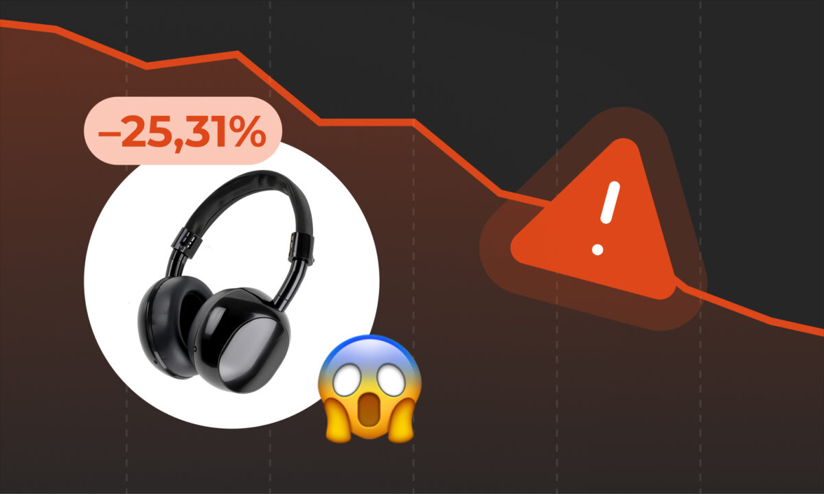
Amazon provides access to millions of customers, but every sale comes with costs that directly affect your margins. A product with strong sales volume can still be unprofitable if advertising costs, fees, or returns are too high.
Profitability comes from consistently managing:
- Product margins
- Amazon referral and fulfillment fees
- Advertising spend
- Inventory turnover
- Return rates
- Pricing strategy
- Cash flow
Rather than asking, “How can I sell more?”, experienced sellers often ask, “How can I earn more profit from every sale?”
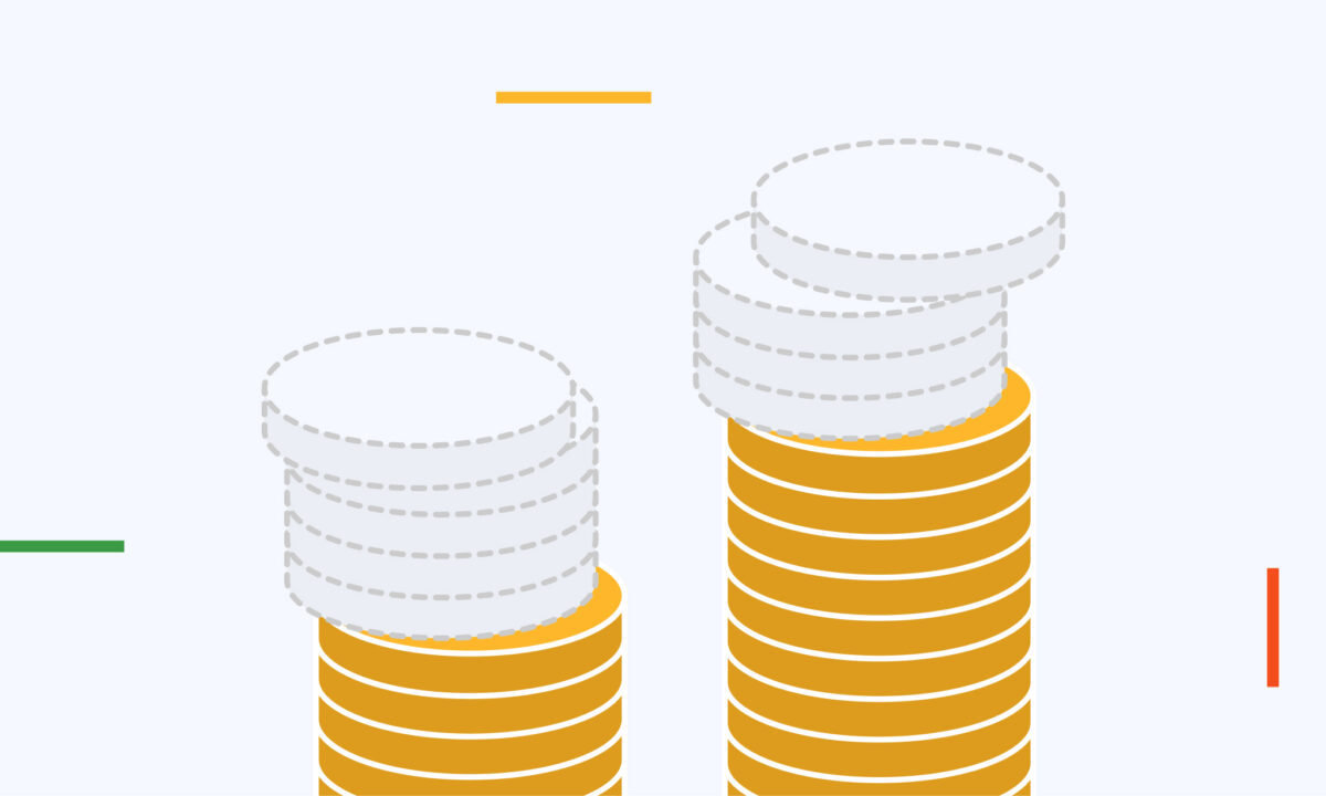
Revenue Is Not the Same as Profit
Revenue is only the starting point.
A business generating $100,000 in monthly sales may earn less profit than one generating $60,000 if operating costs are significantly higher.
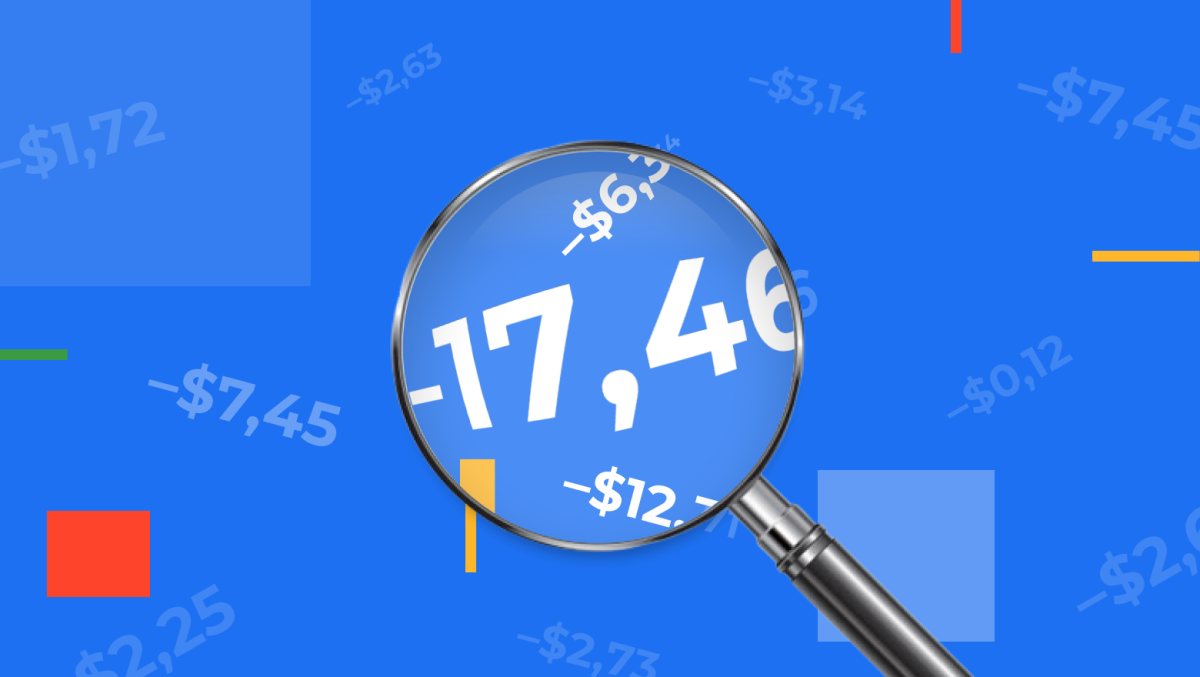
A simplified profit calculation looks like this:
Net Profit = Revenue − Cost of Goods Sold − Amazon Fees − Advertising Costs − Shipping Costs − Returns − Operating Expenses
For example:
| Metric | Amount |
| Monthly Sales | $100,000 |
| Cost of Goods Sold | $42,000 |
| Amazon Fees | $18,000 |
| PPC Advertising | $15,000 |
| Shipping & Misc. Costs | $6,000 |
| Returns & Refunds | $2,000 |
| Net Profit | $17,000 |
Looking only at sales would overlook the factors that actually determine business performance.
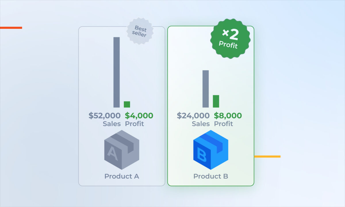
Strategy 1: Optimize for Net Profit, Not Maximum Sales
Increasing revenue isn’t always the best path to higher profitability.
Aggressive discounting or expanding advertising budgets can increase order volume while reducing overall margins.
Instead, evaluate every growth initiative by asking:
- Does this improve net profit?
- Does it increase contribution margin?
- Does it improve return on investment?
A product that sells fewer units at a healthier margin can outperform a high-volume product with thin profitability.
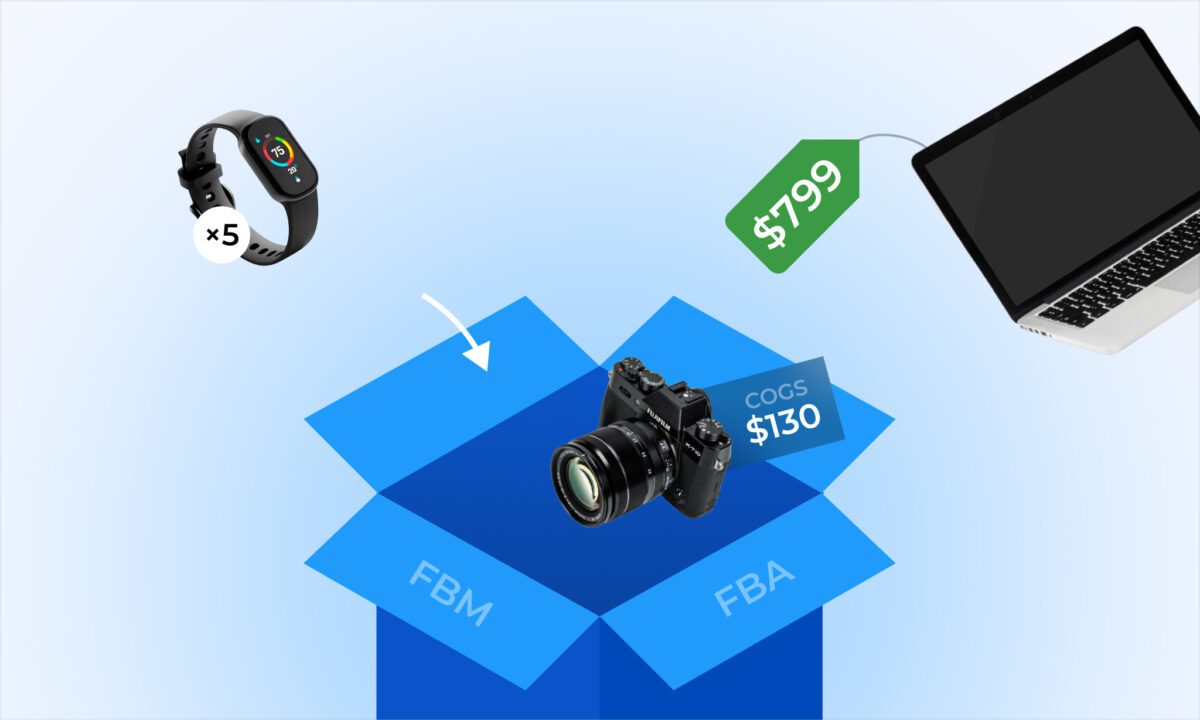
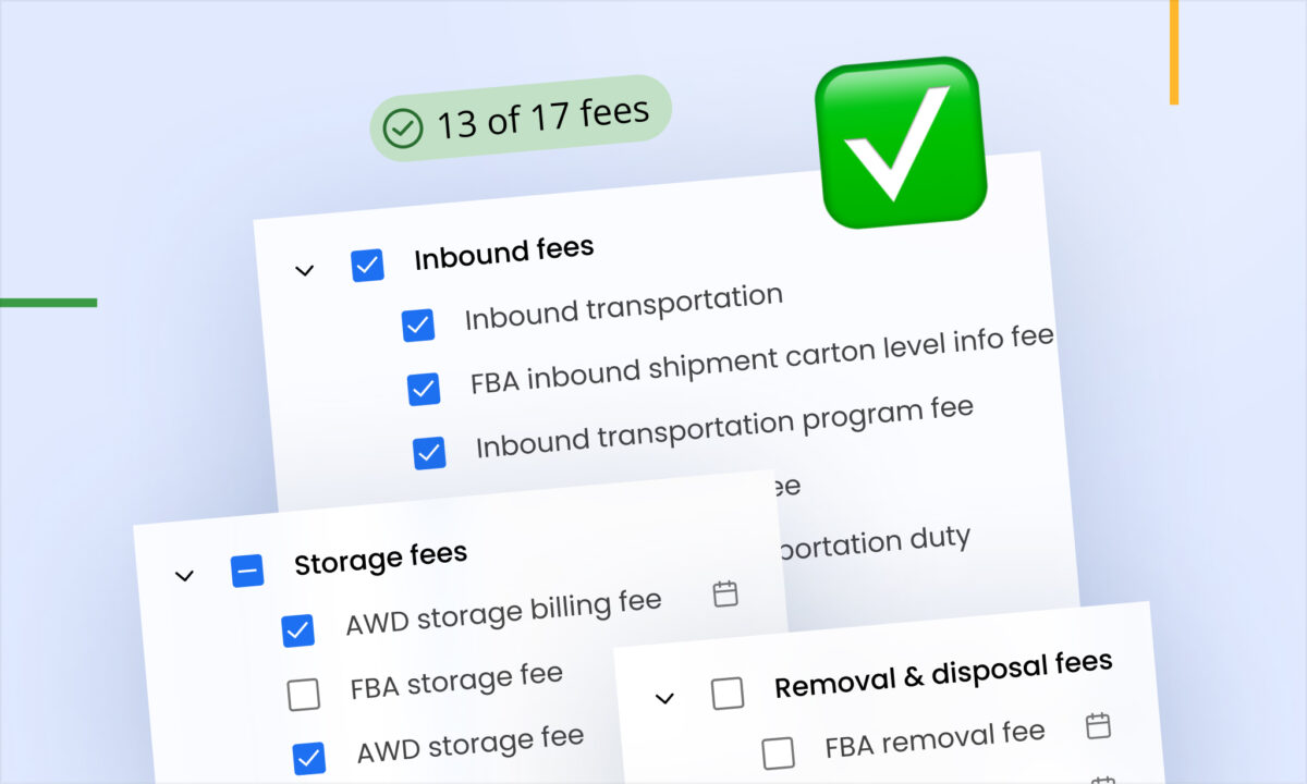
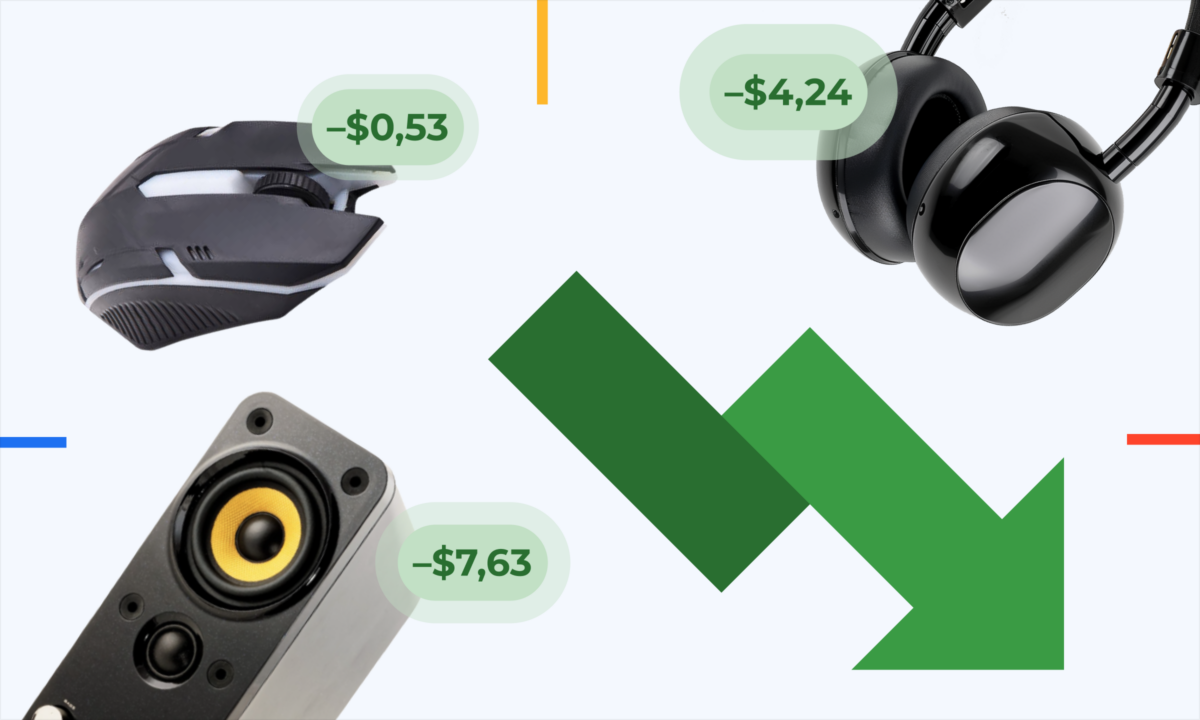
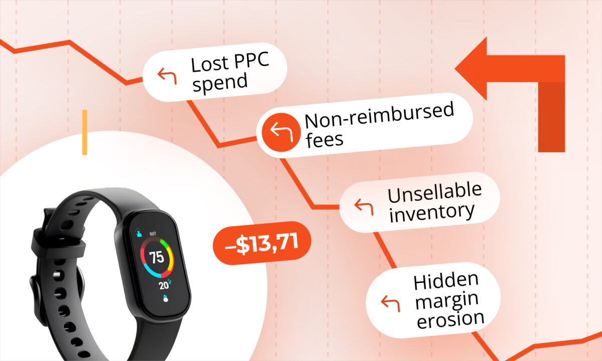
Strategy 2: Understand Your True Amazon Costs
Amazon fees can represent a significant portion of every sale.
Typical costs include:
- Referral fees
- Fulfillment by Amazon (FBA) fees
- Monthly storage fees
- Aged inventory surcharges
- Removal or disposal fees
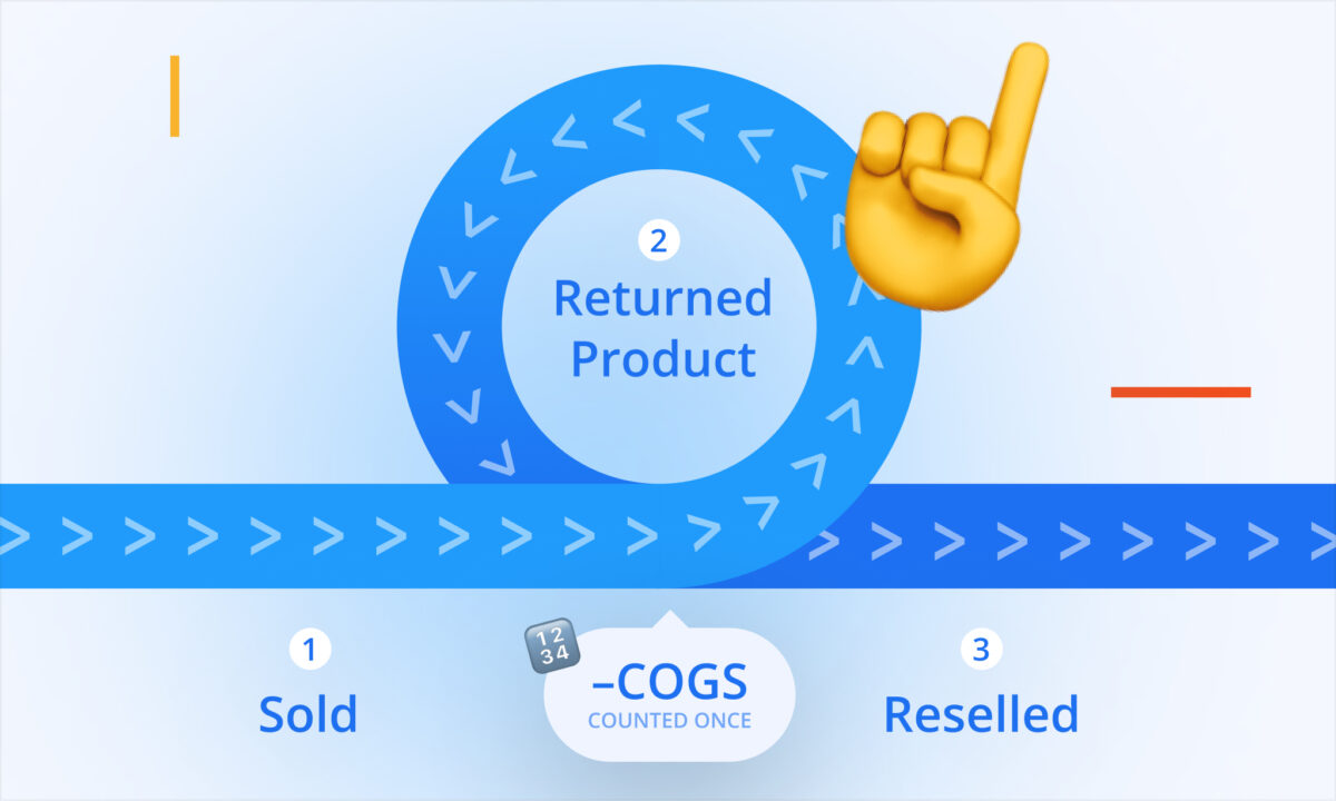
- Return processing fees
- Advertising costs
Because these expenses change over time, reviewing them regularly helps prevent margin erosion.
Strategy 3: Measure Advertising Profitability
Advertising is one of the largest variable expenses for many Amazon businesses.
While metrics such as ACOS (Advertising Cost of Sales) are widely used, they should always be evaluated alongside product margins.
For example:
Product price: $40
Gross margin before advertising: $16
Advertising spend: $8
Net contribution after advertising: $8
The same ACOS can have very different profitability depending on fees, cost of goods, and selling price.
Rather than optimizing for lower ACOS alone, many sellers calculate their break-even ACOS to understand how much they can spend while remaining profitable.
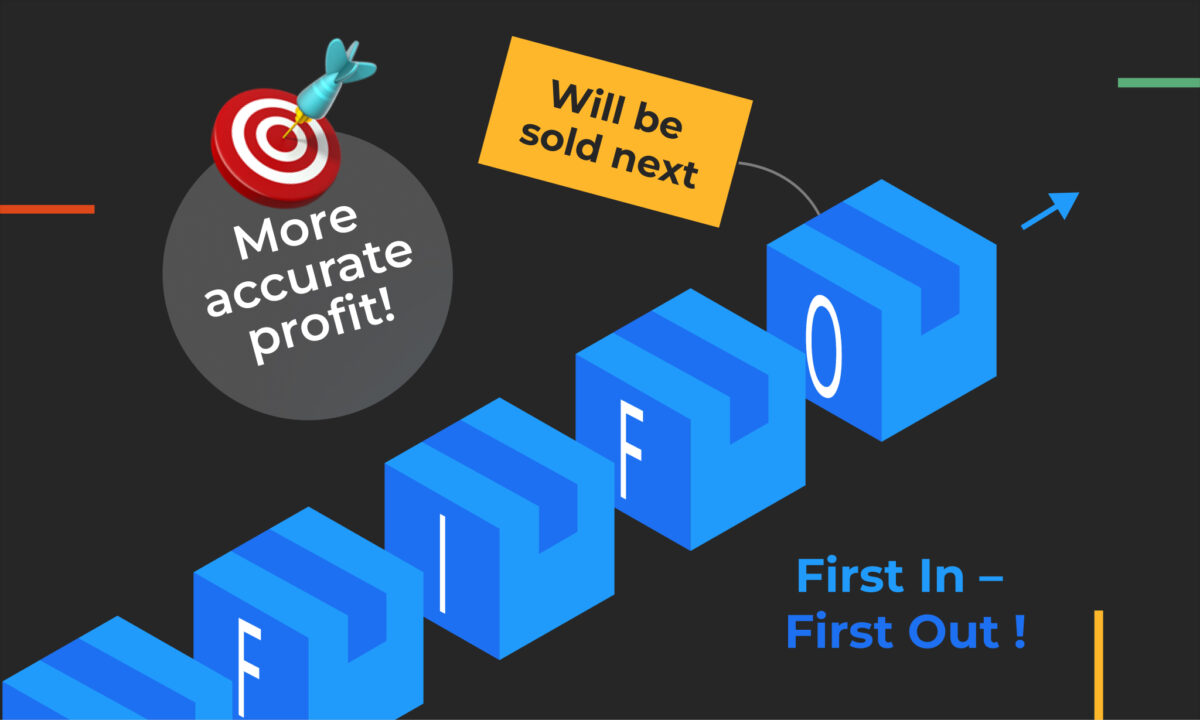
Strategy 4: Improve Inventory Turnover
Inventory ties up capital.
Slow-moving inventory creates several challenges:
- Higher storage costs
- Increased risk of aged inventory fees
- Reduced cash available for new products
- Greater exposure to price changes
Monitoring inventory turnover helps sellers maintain healthy cash flow while minimizing unnecessary storage expenses.
Healthy inventory management is often just as important as increasing sales.
Strategy 5: Build a Pricing Strategy Around Profitability
Price reductions can temporarily increase sales but may reduce overall profit.
Before changing prices, consider:
- Contribution margin
- Competitive positioning
- Advertising efficiency
- Inventory levels
- Customer demand
A small increase in selling price can sometimes improve net profit more than a significant increase in order volume.
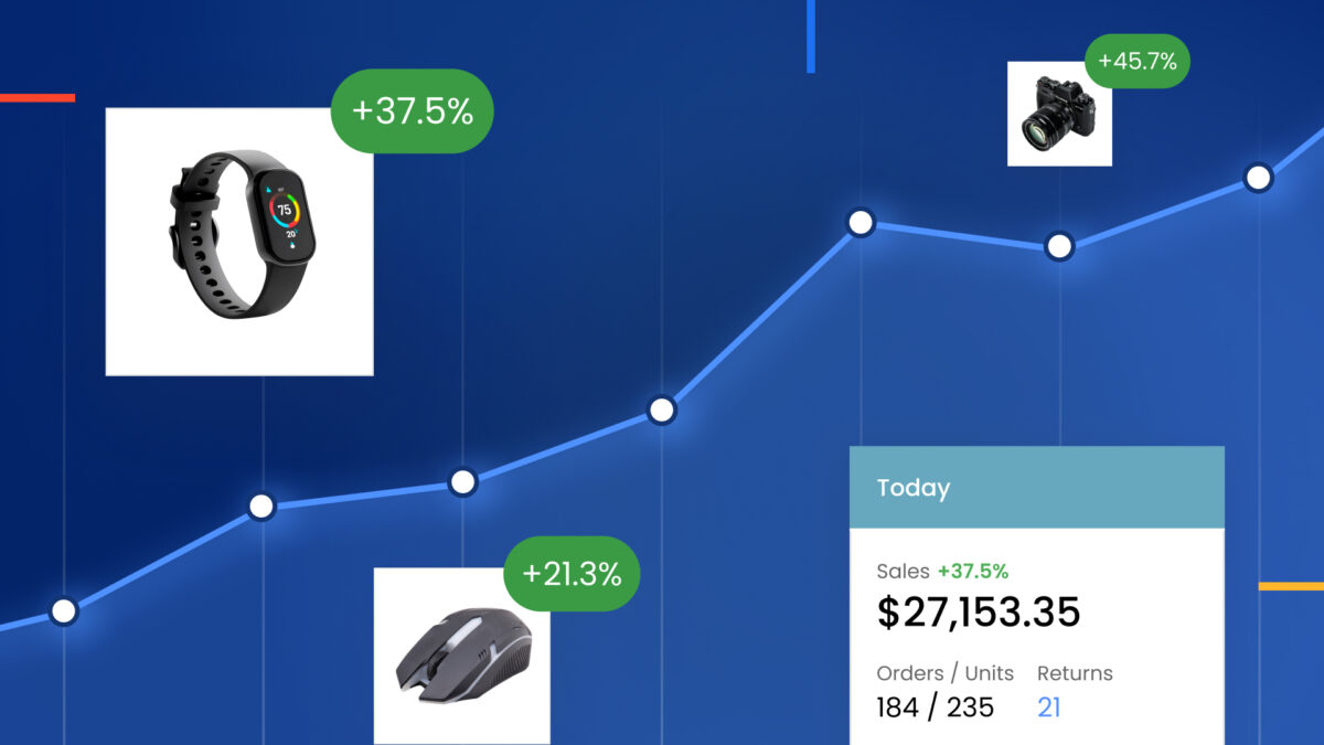
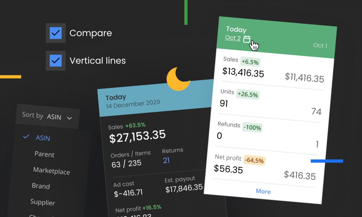
Strategy 6: Monitor Product-Level Performance
Not every ASIN contributes equally to your business.
Regularly reviewing profitability at the product level helps identify:
- High-margin products worth scaling
- Products losing money
- Rising advertising costs
- Increased return rates
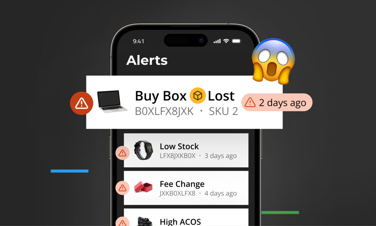
- Fee changes affecting profitability
ASIN-level analysis allows sellers to allocate inventory and advertising budgets more effectively.
Strategy 7: Protect Cash Flow
Profitability and cash flow are closely related but not identical.
A profitable business can still experience cash shortages if inventory purchases, advertising costs, or seasonal demand require significant upfront investment.
Monitoring:
- Inventory value
- Purchasing schedules
- Advertising budgets
- Payment cycles
helps maintain healthy liquidity while supporting growth.
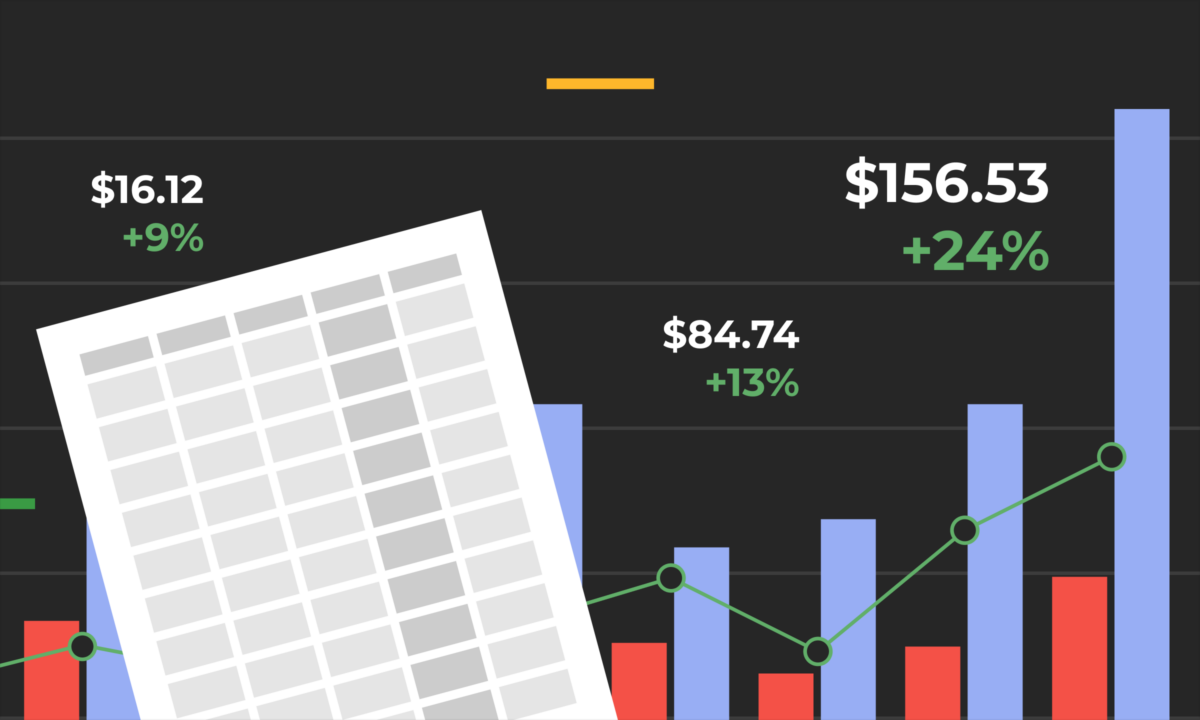
Key Metrics Every Amazon Seller Should Track
Successful Amazon businesses monitor more than sales.
Important metrics include:
- Net profit
- Gross margin
- Contribution margin
- Return on investment (ROI)
- Break-even ACOS
- TACoS
- Inventory turnover
- Return rate
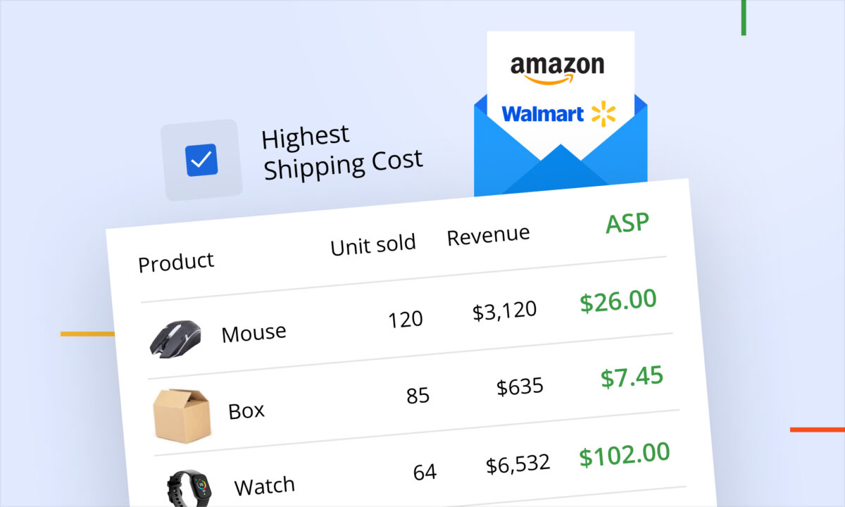
- Average selling price
- Customer acquisition cost
Together, these metrics provide a more complete picture of business performance.
Common Mistakes That Reduce Profitability
Many profitability issues develop gradually rather than from a single decision.
Common mistakes include:
- Increasing advertising without measuring profitability
- Ignoring fee changes
- Overstocking slow-selling inventory
- Competing primarily on price
- Measuring success by revenue instead of net profit
- Failing to review ASIN-level performance regularly
Identifying these issues early can help preserve margins as the business grows.
Best Practices for Long-Term Amazon Success
A practical profitability checklist:
- Review net profit regularly, not just revenue.
- Monitor Amazon fee changes.
- Calculate break-even ACOS for key products.
- Evaluate inventory turnover monthly.
- Review product profitability at the ASIN level.
- Adjust pricing based on margins rather than competitors alone.
- Track refunds and returns as part of profitability analysis.
- Monitor cash flow alongside profit.
Frequently Asked Questions
Is selling on Amazon still profitable?
Yes. Many sellers operate profitable Amazon businesses, but profitability depends on product margins, operating costs, advertising efficiency, and inventory management rather than sales volume alone.
What is a good profit margin for an Amazon seller?
Profit margins vary by business model and product category. Rather than comparing against a single benchmark, sellers should monitor trends in their own margins and work to improve profitability over time.
Why do some Amazon sellers generate high sales but low profits?
High advertising costs, fulfillment fees, storage charges, returns, and aggressive pricing can significantly reduce net profit even when revenue is growing.
What metrics matter more than sales?
Net profit, contribution margin, ROI, break-even ACOS, inventory turnover, and cash flow often provide a better understanding of business performance than revenue alone.
How can sellers monitor profitability more accurately?
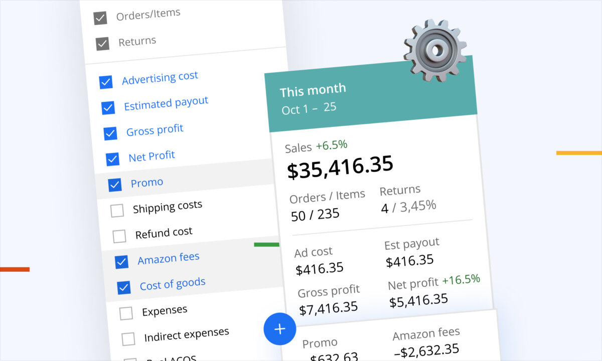
Many sellers use dedicated analytics platforms to consolidate Amazon fees, advertising costs, refunds, inventory performance, and operating expenses into a single profitability view. Tools like sellerboard help track these metrics at the ASIN level, making it easier to understand which products contribute most to long-term business growth.
Conclusion
Selling on Amazon successfully requires balancing growth with profitability. Revenue is important, but sustainable businesses are built by understanding costs, protecting margins, and making data-driven decisions.
By focusing on net profit, inventory efficiency, advertising performance, and cash flow, sellers can evaluate growth opportunities more accurately and build a business that remains resilient as marketplace conditions evolve.