Last time you bought stuff online, can you remember why you chose exactly that item?
For the first impression, buyers rely only on photos.
No matter how sophisticated, Amazon buyers are first engaged by visual elements.
After hundreds of clients we reveal biggest mistakes that sellers do with their Amazon listings:
1. Insufficient number of pictures
I am amazed how much listings have just one or two photos.
And it is the case for listings from 0 to the 3000+ reviews. But please don’t be fooled with those with many reviews, because they started their business long before Amazon market became so popular.
However, buyers want to know how your brand looks like from all sides, and all features, even what is inside!
You need to show them as much as possible, or they will move to competitors.
So, please put at least 6 photos in the listing.
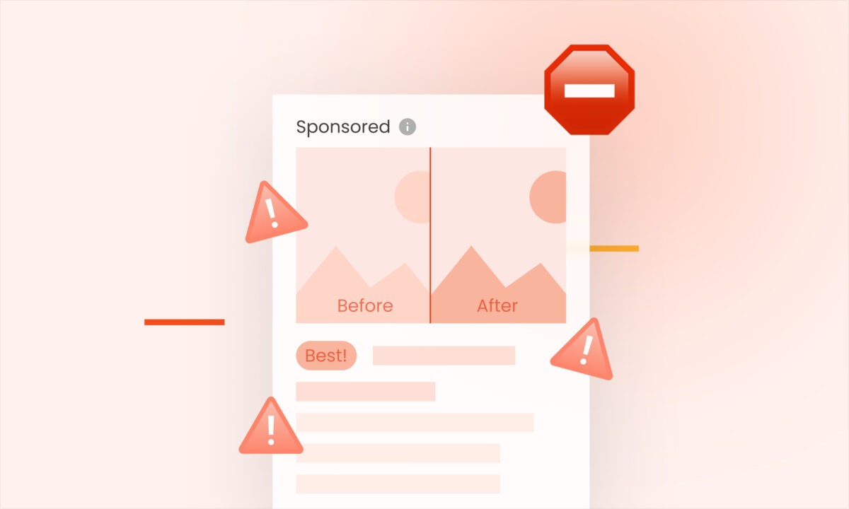
2. Unprofessional graphic content
Cheap or visually bad graphics content like fonts, icons, and other drawings will create a bad impression about your reputation.
Maybe they will not notice what is wrong exactly, but they will have a feeling that “something” isn’t right.
They will connect that issue with quality, which does not necessarily case, but that pix is everything that they have to decide is it worth buying or not.
Focus on this, and try to use as much as possible professional and appropriate fonts, icons, badges, and other graphics.
For example:
Fonts like Dinot, Bebas Neue, Roboto or Helvetica are always better than some “fancy” fonts like Comic Sans, Curlz, Brush Script, Tempus Sans, etc.
Badges and icons with choppy edges are exactly what you need to avoid.
3. Lack of information
After you got their attention with good-looking pictures, they want to know things like:
-size
-weight
-key features
Things that make your stock so special or better than others.
From which material it is made? Does it contain any allergens? Are there any “tips and tricks” for using?
All that stuff which they can’t find in the real store.
So, have in mind which details you to look for when you are in real store, same things are crucial when they are shopping online.
4. Keep it simple
You probably heard “The less is more” and that is correct, look at Apple website, there are no unnecessary details.
Try to avoid any background with details when you are showing your brand, that will distract attention, and you can lose conversions.
There is already a storm of thoughts in customer brain which to choose.
After they look at an overcrowded piece of screen, the brain will alarm “Fight-or-flight” response, and the customer will move to the next product.
So, we need to inform them, but not exaggerate!
For example:
When you want to show ‘product in use’, background with low details is something that you need.
If you are writing text features let’s say about 5-9 features is enough.
Features should contain one or few words, not big sentences or even paragraphs.
5. Blurred photos
Another conversion killer.
Nowadays that issue is a sign of an amateur or mediocre approach to the market.
Do not shake camera/phone while taking pictures, always focus before click “shoot” button.
If you can’t buy a tripod try to hold the camera on some steady surface.
For example:
Sharp pic requires enough light, so try to ensure as much as possible light. The camera will automatically increase shutter speed and photos will look great.
In case that you can’t provide a sufficient amount of light, then you need some kind of camera stand, no matter is it stand or chair.
Without plentiful light camera will extend shutter speed which means that every movement in that period will be shown as a fuzzy area on the pic.
6. Bad lighting
Dark or pic will low contrast is something that customer will notice for sure.
Maybe they will not notice at the first moment what is wrong with those images, but it will affect their decision “buy or not”.
Provide enough light when shooting your photos, because it will affect the quality and you will have less work later in editing.
In case that you can’t provide more light, decrease shutter speed and provide a steady position for the camera while shooting.
But, if you get dark photos, there is plenty of online editors that can fix that.
For Example:
Canva, BeFunkey, Pizap, Lunapic.
7. Tiny items or showing just package on the main photo
Majority of sellers know Amazon’s rule that 85% of photo surface should be covered with product.
Many of them selling tiny products such as screws are making mistake to gather screws on one pile and cover 85% of space.
Instead of that, professionals take a photo, for example, of one screw and expand it all close to the edges.
Another mistake is showing just a package of the product without clear preview what is inside.
Always put yourself in the role of customer, one photo of the box doesn’t reveal anything.
It’s just a box. 🙂
For Example:
If you sell screws, take a photo of one screw/earring/pencil and zoom it on the main page as much as you can.
That way it will not just look great, you are also ensuring “pop-up” effect and easy noticing in an ocean of wrong formed main pictures.
8. Not showing lifestyle or product in use photos
When consumers are scrolling through listings and products, they visualize that they already own it.
They need to connect with that product in some way, the photo where someone holds or use product will help them in that.
Have in mind that some products have a completely unknown purpose until you show it “in action”.
They want to be sure does it suit their needs.
You can ask your friend to use your product and take a few shots, or you can hire real photographers or models.
Whatever you choose to try to provide them that sense of user device.
If after all these instructions you are not sure what to do with your photos, you can reach awesome guy Marko from Pro-FBA-Images (www.pro-fba-images.com) on: info@pro-fba-images.com, he will give you a free advice for any questions related to product photos.